Art Nouveau
(literally translates to ‘New Art’) is an artistic style that flourished in Europe
and the US from around 1890 to 1910. The style of Art Nouveau is characterized
by its detail orientedness and features long, elegant, rhythmic and organic
lines. It features the graceful use of flowers, buds, vines, leaves, insects
and other delicate organic life. The movement drew inspiration from both nature
and geometry. Art Nouveau influenced illustration, graphic arts, furniture,
ornamental designs, stained glass, architecture and so on.
Art Nouveau sought
to move away from the academic type art, such as historicism, that was popular
around the 19th century and to modernize design. It could be seen as the first
attempt to modernize art and design, however the movement faded with the ending
of World War I.
Defining Artists
Alphonse Mucha
Alphonse Mucha is most known for his theatre posters during this period. His posters mostly featues theatre actresses and other women in a portraiture of fantasy. The artist rejected the label of Art Nouveau, however the style was developed through his influence.
F. Champenois 1897
Gustav Klimt
Prior to the movement Klimt was already known for his very embellished style of work. During his “Goldern Phase” which lasted from to, some of Klimt’s well known works such as The Kiss, is considered a leading example of the Art Nouveau movement.
“Certainty is a closing of the mind. To create something new you must have doubt.”
Milton Glaser
Milton Glaser is a renowned American designer and illustrator. Born in 1929 New York City, Glaser studied at the High School of Music and Art, then the Cooper Union School of Art in New York. After which he finalized his studies at the Academy of Fine Art in Italy. He is also the co-founder of Pushpin Studios and New York Magazine. During 1954, the use of naturalistic illustration for mass media imaging was on the decline as photography and television began to change the visual communication industry.
Glaser and his team at Pushpin Studios drew from popular culture, their understanding of modern art and non-western art, to construct an new conceptual approach to graphic design. A naturalistic and traditional approach to graphic design was at the core of this new approach. Glaser believes that computers streamlines the approach to design.
“Computers are to design as microwaves are to cooking.”
Milton Glaser
Gallery
I Heart NY
Milton Glaser is probably best known for his I Heart NY design.
This design is a logo that was accompanied by a song and is the basis of an advertising campaign and have been used since 1977 to promote tourism in New York City. In the vastly multicultural diaspora of the city, anyone there could translate image, which is the core of visual communication. The logo was created 4 decades ago and is now symbolic to the spirit or New York.
Bob Dilan’s Greatest Hits Album Poster
Another well know design from the artist is his special poster mad to accompany Bob Dilan’s Greatest Hits album in 1966. The poster features a silhouette of Bob Dilan in profile and his curly hair implied with curly and wavy shapes in very saturated colours. This alludes to the popularity of psychedelic drugs that was gaining popularity in the counter culture at the time.
Inspired Works
Portrait of Milton Glaser by illustrator Jeanne Detallante for the Observer (2016). The swirls and saturated colours are inspired by Glacer’s Bob Dylan Greatest Hits album poster.
“Day Dreamer” (2018) by Vincent Trinidad inspired by the concept of psychedelia in Glacier’s Bob Dylan Greatest Hits album poster.
Morag Myerscough is a designer born in Holloway, North London in 1963. She was raised in a fairly unconventional family of musicians, artists and performers. Inspired by her environment, Myerscough decided to study art at the Center of Saint Martens in London followed by the Royal College of Art.
Myerscough’s work is anything but subdued. Her work is characterized by use by its playfulness, boldness and its creation of an engaging and whimsical environment. “Myerscough is known around the world for her distinct approach making large scaffold structures adorned with neon geometric patterns and shapes often incorporating positive messaging hand painted onto plywood.” (Design Indaba). Often collaborating with architects and communities, Myerscough creates spaces that reflects the identity of the users in the local area.
Gallery
Some of
Morag Myerscough’s noted works include:
The Temple of Agape (in collaboration with Luke Morgan), 2014
The Temple
of Agape was designed for London’s Festival of Love in 2014. Based on the Greek
concept of agape love, “love for humanity”. It is constructed from plywood and
scaffolding.
Photography by Gareth Gardner
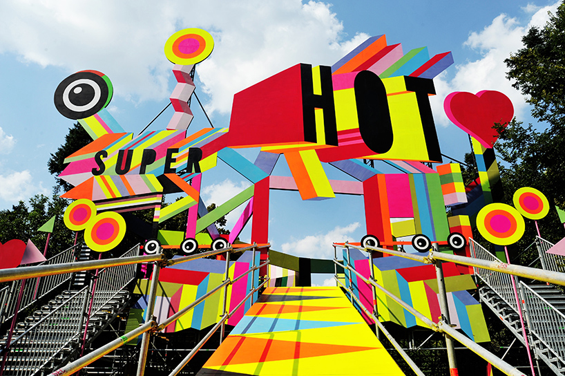
Super Hot (in collaboration with Luke Morgan), 2017
This huge neon installation created for the 7th Summer
Well Festival in Romania, as a stage for live performances. The installation rises
from amongst the trees, and by night,
transforms into a whimsical glowing performance venue. Also made from plywood
and scaffolding.
Photography by designdoom
In conclusion, I think Myerscough’s work is very effective at creating inviting and joyful environments. Her use of vibrant neons and lively composition truly helps to amplify the purpose of her work and her pieces inevitably captures the attention of her audiences. I also find her installations very suitable for public spaces as the alluring and exuberant nature of her work creates an ambiance for spaces where people can enjoy themselves.
Deconstructivism
is an artistic movement that started in architecture by the end of the 1980s.
It criticizes the rational order, purity, and simplicity of modern design and
developed a new aesthetic based on complex geometries. It’s often considered a
current of postmodernism. It is characterized by its lack of predictability and
harmony in design.
One of the
most defining characteristics of deconstructivism is that it challenges
conventional ideas about form and order, as if the designs tried to liberate
architecture and art from preconceived rules. The forms often disturb our
thinking and evoke uncertainty and unpredictability. Through the controlled
chaos, they challenge our own preconceptions.
The designs
consist of irregular complex geometries, and the objects are often formed by
several different fragments put together without any apparent order.
Gallery
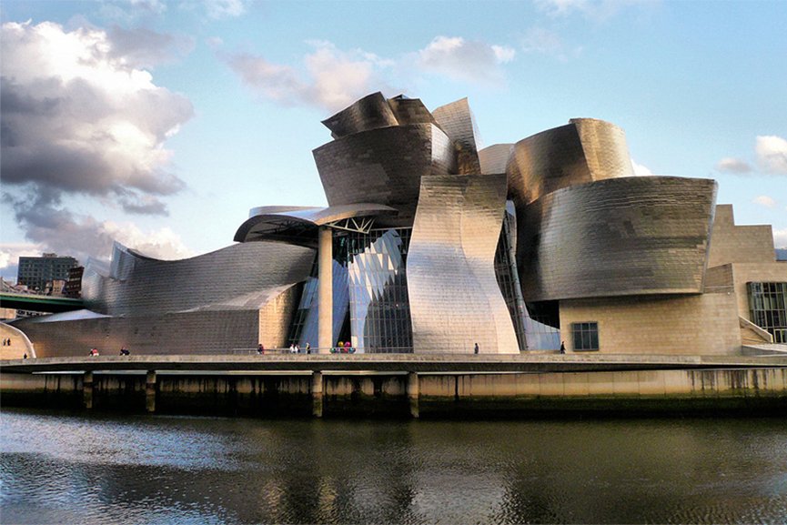
One of the
prime examples of Deconstructivism, the Guggenheim Museum in Bilbao represents
a fusion of complex, swirling forms and captivating materiality.
Neville Brody experimented with typographic design in his magazine Fuse. He invited designers to address social issues his magazine through the application of experimental typefaces, thereby encouraging and inspiring them to push the limits of the definition of typography.
Saul Bass was a prominent
American graphic designer of the twentieth-century. He largely designed motion
picture title sequences, corporate logos and movie posters. He was a pioneer of
the modern title sequence designing. He enjoyed four decades of successful
career in his lifetime, winning Academy Award for his exquisite graphic
designing.
Saul Bass was born in 1920 in Bronx, New York. He began his studies as an artist at the Art Studnts League in Manhattan, then later at Brooklyn College. Upon completion of his studies, he worked as a freelancer for several advertising companies and agencies, including the illustrious Warner Bros. He moved to Los Angeles, where he pursued graphic designing as a commercial artist. During 1940’s he took up some Hollywood projects, which involved the print work for promotional purposes. In fact, he started up his own practice in 1952 and a few years later established his private firm as Saul Bass & Associates.
Gallery
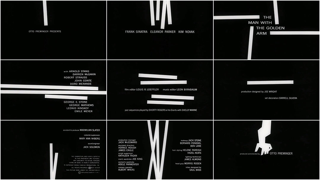
One of Bass’ mandates for
designing for film was informing the audience of the tone and story of the film
before the first scene appeared on the screen. This is an aspect of his design
which is blaringly obvious in The Man with the Golden Arm — white lines,
referencing the drug addiction through their stabbing motions towards the
audience, as if they were needles, but also representing — at times — his
desire to be a musician, more specifically, a drummer (the white bars often
appear in pairs, being analogous to drum sticks).
Logos for Quaker Oats, United, Minolta, the Girl Scouts of America, Dixie cups, Frontier Airlines, United Way, General Foods, AT&T, and Geffen Records were all rendered by Bass. And many of the logos that have been tweaked over the years, such as Kleenex, still stay true to his original vision and remain largely inspired by Bass’ suggestions.
Inspired Artists
Fan made poster for Willy Wonka and the Chocolate Factory by Hey Lucky
Fan made poster for Willy Wonka and the Chocolate Factory by Hey Lucky
Minimalism
is an Avant Garde movement that shows evidence of its advent in the 1950s.
Minimalisim in art can be considered as a form of abstraction in art as itbegan
to turn away from the gestural art of the previous generation. Aesthetically,
minimalist art offers a highly purified form of beauty. It can also be seen as
representing such qualities as truth (because it does not pretend to be
anything other than what it is), order, simplicity and harmony.
Minimalism is categorised by: geometric single or repeated
forms, deliberate lack of expression, self referential, factory manufactured or
store-bought materials and space awareness.
Although
radical, and rejecting many of the concerns of the immediately preceding
abstract expressionist movement, earlier abstract movements were an important
influence on the ideas and techniques of minimalism. the Russian constuctivist
and suprematist movements of the 1910s and 1920s, such as the reduction of
artworks to their essential structure and use of factory production techniques,
became more widely understood – and clearly inspired minimalist sculptors.
Defining Artists
Frank Stella
Die Fahne
Hoch! (1959)
Unquestionably
a key monument in modern art, this work, one of the series of Black Paintings
done by Frank Stella, is a bold counter-movement against the eminent Abstract
Expressionist painters. It is a monochrome rectangular painting on a heavy
chassis projecting from the wall into surrounding space as if urging the viewer
to move back. Magnetized, the viewer is drawn closer seeking to read the
pattern of pinstripes on the surface. These stripes are in fact the raw canvas
revealed between broad black stripes painted with few visible brushstrokes.
Frank Stella Die Fahne Hoch! (1959)
Tony Smith, Die 1962
The sculpture’s deceptively simple title invites multiple associations: it alludes to die casting, to one of a pair of dice, and, ultimately, to death. As Smith remarked, “Six feet has a suggestion of being cooked. Six foot box. Six foot under.” Rationality, evoked by Die’s purely geometric configuration, is countered by the sculpture’s brooding presence. Meaning becomes relative rather than absolute, something generated through the interplay of word and object. Weaving together strains of architecture, industrial manufacture, and the found object, Smith radically transformed the way sculpture could look, how it could be made, and, ultimately, how it could be understood.
Tony Smith, Die 1962 The pointed ears and symbol of Batman are all fans need to see in order to be reminded of the caped crusader’s ethos. Design by Calvin LinLord of the Rings posters by Michal Krasnopolski
Stefan Sagmeister is a renowned Austrian-born US based contemporary graphic designer and typographer. The artist is well known for his wit and his outlandish and rebellious sense of humor he displays in his work
Sagmeister was born in Brebenz,
Austria ,in 1962. After graduating highschool, he enrolled in an engineering
collage, but later enrolled in a graphic design course, which started his
carrer a a graphic designer. At the age of 19, he applied for the University of
Applied Arts Vienna to study graphic designing. Although, at first he was
refused the admission on the basis of his amateur drawing, his application was
accepted on second attempt. In 1987, owing to his remarkable performance, he
earned a Fulbright scholarship for the New York based Pratt Institute.
Sagmeister returned to Austria
after his studies then later moved to Hong Kong where he worked as a
typographer. then moved to New York where decided to set out on his own as a
designer and began working on music graphics such as album covers, which earned
him several Grammy nominations.
In 2012 a huge decision was made
by Sagmeister inc., they where to go in a new company direction.
To show this massive development in the direction of the company Sagmeister referred to the original announcement of the opening of Sagmeister inc., were he posed naked in his office with his arms folded 19 years before hand. The new idea was to stage the same image however this would include a naked Jessica Walsh on a pile of new papers and magazines beside him. Clearly showing the beginning of the new company ‘Sagmeiter and Walsh’. Jessica Walsh was a 25 year old talented graphic designer working as the art director at ‘Print Magazine’. After emailing Sagmeister to look through her portfolio if work she got the response almost immediately; “When do you want to come work for me?”. The next day she quit her job to work with Sagmeister.
Gallery
AIGA Detroit
In his most famous poster, for a lecture at Cranbrook college near Detroit, Sagmeister sought to visually convey the pain that accompanies most of the studio’s design projects. He asked an intern to carve all the text onto his own torso with an X-Acto knife and photograph the result.
Stefan Sagmeister, AIGA Detroit, 1999
The Rolling Stones, Bridges to Balylon album cover 1997
“Design is so simple, that’s why it is so complicated.”
– Paul Rand
Paul Rand
(born Peretz Rosenbaum) is an American
graphic designer and art director. Rand was born in Brooklyn, New York on
August 15th, 1914. He had an interest in art and design from an
early age, however his father didn’t think being an artist would be a self
sustaining career. He was enrolled at Manhattan’s Harren High School, however
while studying there he attended classes at the Pratt Institute. After which he
attended The New School for Design, the Art Students League and Yale
University. Rand stood out by practicing Swiss Style of graphic design in an
American industry. He is very well known for reinventing the corporate logo and
his logo designs for IBM, ABC, Morningstar, Yale university and others. He has
also done page layout design for popular periodicals such as GQ magazine and
Esquire.
Throughout his career, Rand has
also collaborated with Steve Jobs in the branding of NeXT Computer. He also
joined the faculty of Yale university, as an instructor in graphic design and
has written several works on graphic design such as Thoughts on Design (1947), A
Designer’s Art (1985), Design, Form, and Chaos (1993),
and From Lascaux to Brooklyn (1996).
Rand Paul died of cancer in
1996, at the age of 82.
Gallery
IBM Logo
Under Thomas Watson Jr’s
management, the image was of IBM was due for
reinvention and Paul rand was hired to do the job. The aim was to
transform IBM from simply a computer company to a modern company with
character. Rand produced several evolving designs. He also designed the
“Eye-Bee-M” poster which went with the company’s motto “THINK”.
ABC logo
Paul Rand also redeigned the
logo for ABC in 1962. Which is more bold and simple than previous designs.
NeXT Computers Logo
After Apple Computers, Steve
Jobs Moved on to NeXT Computer and Rubin was hired to design the logo. He
prioritised the simplicity and playfulness that Jobs like from the previous
Apple logo.
Inspired works
Shanghi Style Eye-Bee-M by Miko,
Jean and Yuanyuan
Overall Paul Rand is best know
for reinventing and deigning logos with personality and character and pushed a
new and modern trend in graphic design
“They always say time changes things, but you actually have to change them yourself.”
― Andy Warhol
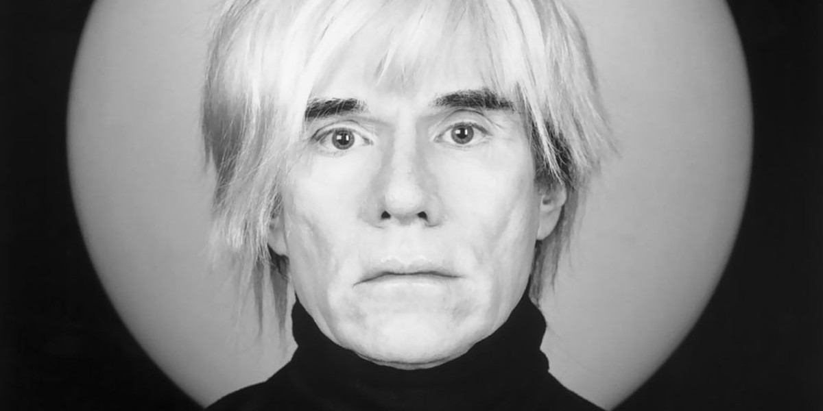
Andy Warhol was a painter, film maker and print maker born in Pittsburgh, Pennsylvania. Warhol attended Carnegie Institute of Technology (now Carnegie Mellon University), where he received formal training in pictorial design. In 1949, he began working as a commercial illustrator, doing projects with magazines such as Glamour, Vogue, Harper’s Bazaar and The New Yorker.
Warhol Began painting in the late 1950s. With a fascination with commercialism and pop culture, he exhibited paintings featuring Campbell’s Soup cans, Coca-Cola bottles and Brillo pad replicas. He also began making silk screen prints of celebrities in garish colours. These works put Warhol at the forefront of the Pop art movement in America.
Pop art was a movement that emerged in the late 1950s that challenged the traditions of fine art by including imagery from popular and mass culture, such as advertising, packaging, comic books, celebrities and mundane cultural objects.
In
1964, Warhol opened his own art studio, a large silver-painted warehouse known
simply as “The Factory.” The Factory quickly became one of New York
City’s premier cultural hotspots, a scene of lavish parties attended by the
city’s wealthiest socialites and celebrities
With the progression of the 60s, Warhol began to explore filmmaking. Some of his most famous films include Sleep, which depicts poet John Giorno sleeping for six hours, and Eat, which shows a man eating a mushroom for 45 minutes. Warhol also explored television, photography and sculpture within his career.
Gallery
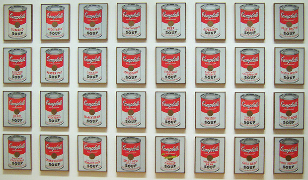
Though Campbell’s Soup Cans resembles the mass-produced, printed advertisements by which Warhol was inspired, its canvases are hand-painted, and the pattern ringing each can’s bottom edge is hand-stamped. Warhol mimicked the repetition and uniformity of advertising by carefully reproducing the same image across each individual canvas. He varied only the label on the front of each can, distinguishing them by their variety. Warhol repeatedly ate Campbell’s soup for lunch repeatedly for 20 years.
32 Campbell’s Soup Cans 1962 – Andy Warhol
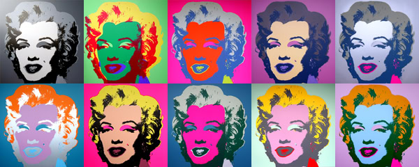
For Warhol, Marilyn was already a familiar subject. He initially began depicting the actress in the Marilyn Diptych, 1962, shortly after her death. Monroe is a pop culture icon. Warhol’s depictions of women and starlets of the time explored the relationships between consumer society, fashion, fame, sensationalism and death. It is also said that through his distinctive style of work, Warhol referred to a society in which individuals were seen as mere products rather than human beings.
Inspired
works
Takashi
Murakami
Often
referred to as Japan’s response to Andy Warhol, Murakami is also know for
blurring the line between commercial and fine art.
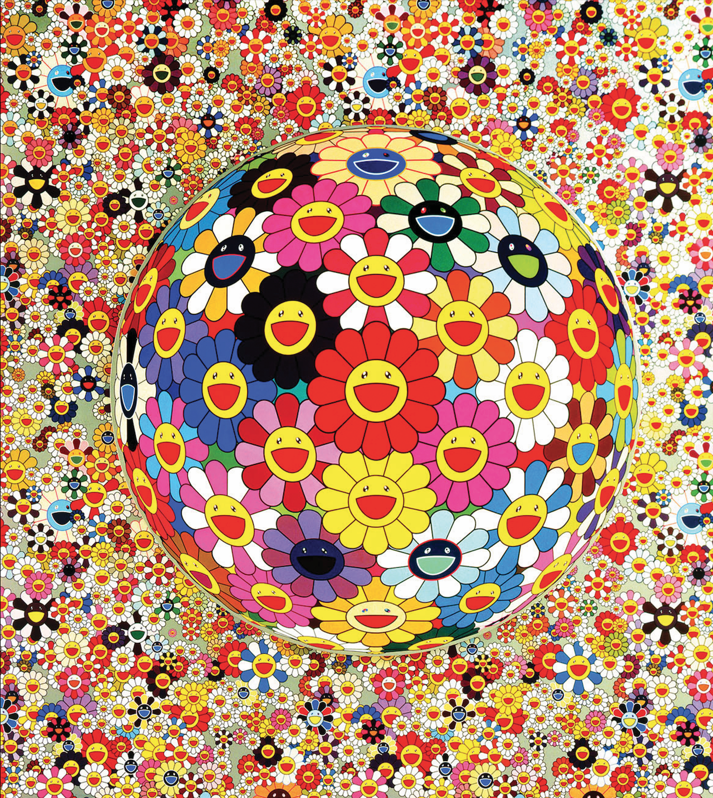
Takashi Murakami, Flower ball (3D), 2002, Acrylic on canvas mounted on board
Gianni Versace’s SS91 Pop Art collection featured a jewel-encrusted dress emblazoned with Warhol’s Marilyn Monroe prints, worn by supermodel Linda Evangelista. Both glamourous and sexy, the dress defined 90s fashion and as one of Versace’s most celebrated creations is now owned by the Metropolitan Museum of Art in New York.
The
international typographic style is an approach to design in a neutal and
objective way. The movement de-emphasized subjectiveness, or the individual
perspective of the artist. To create designs that were clear and moral with no
political agenda. The content of the design was prioritized. It was
a post-war movement after the power of propaganda (and design within that) was
witnessed by those in Europe during WWII. This is important as it impacts much
of the graphic design we see today.
The international
typographic style features crisp, blocky, clear layouts, minimalist design
ethos and sans serif typefaces. Designers also turned to photography as a
preferred image source, as it was able to produce an objective non-biased
record of the subject.
Some key events that helped with the development of the international typographic style.
Akzidenz-Grotesk is a sans-serif typeface originally released by the H. Berthold AG type foundry in 1896 under the title Akzidenz-Grotesk. It was the first sans-serif typeface to be widely used.
Akzidenz-Grotesk Typeface Poster
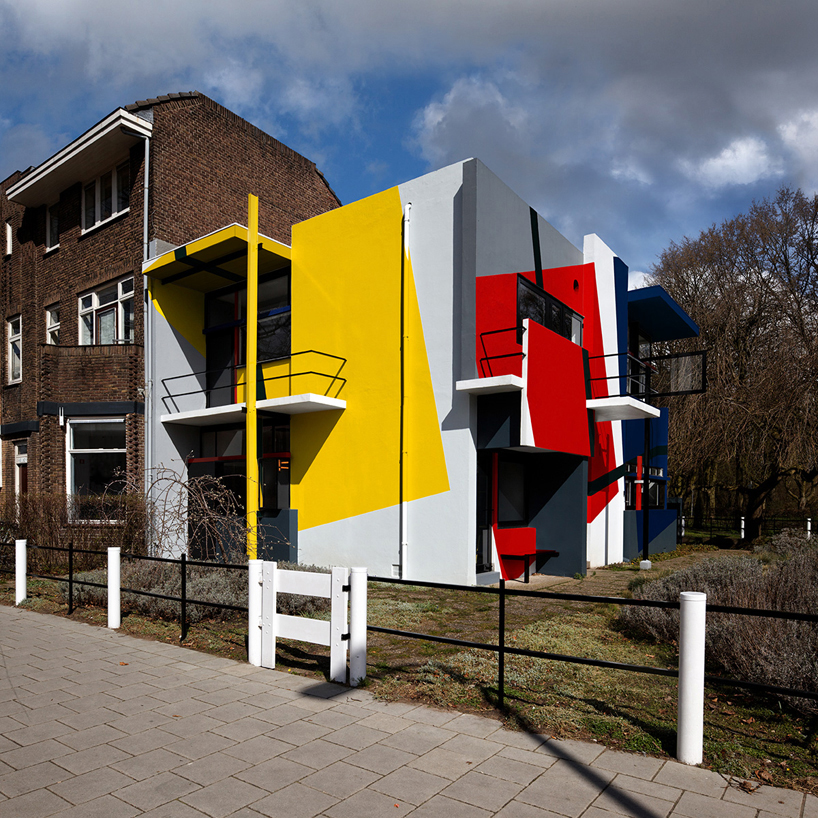
De Stijl
De Stijl also known as neoplasticism (a style of abstract
painting developed by Piet Mondrian, using only vertical and horizontal lines
and rectangular shapes in black, white, grey, and primary colours.) was a Dutch
artistic movement founded in 1917 in Leiden. The term De Stijl is used to refer
to a body of work from 1917 to 1931 founded in the Netherlands
They advocated pure abstraction and universality by a reduction to the essentials of form and colour, they simplified visual compositions to the vertical and horizontal directions, and used only primary colors with black and white.
Staatliches Bauhaus commonly known as Bauhaus was a school in Germany which operated from 1919 to 1933 that combined crafts and the fine arts, and was known for the approach to design that it publicized and taught. The Bauhaus school was founded by Walter Gropius in Weimar. It had a intense influence upon subsequent developments in art, architecture, graphic design, interior design, industrial design, and typography.
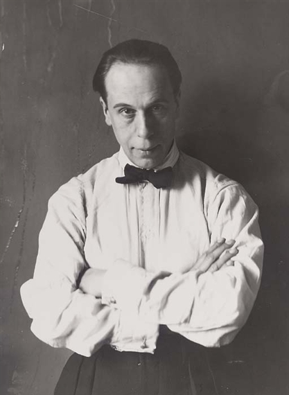
Theo van Doesburg( born Christian Emil Marie Küpper), was
born in Utrecht, the Netherlands, on August 30, 1883, died 1931. He was a dutch
painter, decorator, writer, art critic and the leader of the avant garde
movement, De Stijl In 1917.
De Stijl or Neoplasticism is a Dutch art movement that
influenced art, architecture and design. The movement completely embraced the
abstract. The aesthetics of the movement featured simplistic elements such as
geographic shapes lines and primary colours .
Van Doesburg was an
artist in the Impressionist and Fauvist style until he turned to geometric
abstractions of subjects from nature. His works featured strictly geometric
shapes, vertical and horizontal lines and primary colours. Later in his carrer
he introduced the diagonal line. Doesburg started to focus on promoting the De
Stijl movemrnt in Germany and fracnce by lectureing at the Weimar Bauhus.
In 1931, Doesburg was involved in the formation of the abstract
creation association, agroup of artists that promoted pure abstraction in art.
Does burg is also known for developing a sans serif modular typeface called VAN DOESBURG’S ARCHITYPE that was finalised in 1919.
Gallery
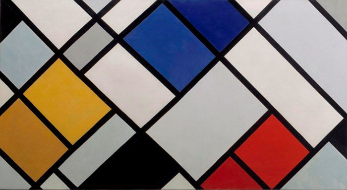
Counter Composition in Dissonance 16 (1925)
This piece is the most well known of the Counter Compositions series. It features rectangles made with thick black lines tilted at a 45 degree angle. The tones of yellows, reds, blues greys and whites in the paining are subtley shifted throught the painting to create a complex and dynamic balance.
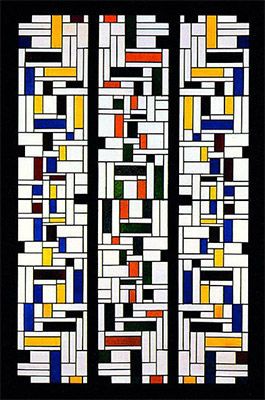
Stained glass Composition IV (1918)
Created for the de Lange House, this stained glass piece was
made as Doesdurg explored the decorative and applied arts.
Inspired Works
Neoplasticism Tattoo #2 is a painting by Ed Hernandez
“Design is so simple, that’s why it is so complicated.” – Paul Rand
Paul Rand
(born Peretz Rosenbaum) is an American
graphic designer and art director. Rand was born in Brooklyn, New York on
August 15th, 1914. He had an interest in art and design from an
early age, however his father didn’t think being an artist would be a self
sustaining career. He was enrolled at Manhattan’s Harren High School, however
while studying there he attended classes at the Pratt Institute. After which he
attended The New School for Design, the Art Students League and Yale
University. Rand stood out by practicing Swiss Style of graphic design in an
American industry. He is very well known for reinventing the corporate logo and
his logo designs for IBM, ABC, Morningstar, Yale university and others. He has
also done page layout design for popular periodicals such as GQ magazine and
Esquire.
Throughout his career, Rand has
also collaborated with Steve Jobs in the branding of NeXT Computer. He also
joined the faculty of Yale university, as an instructor in graphic design and
has written several works on graphic design such as Thoughts on Design (1947), A
Designer’s Art (1985), Design, Form, and Chaos (1993),
and From Lascaux to Brooklyn (1996).
Rand Paul died of cancer in 1996, at the age of 82.
Gallery
IBM Logo
Under Thomas Watson Jr’s management, the image was of IBM was due for reinvention and Paul rand was hired to do the job. The aim was to transform IBM from simply a computer company to a modern company with character. Rand produced several evolving designs.
He also designed the “Eye-Bee-M” poster which went with the company’s motto “THINK”.
ABC logo
Paul Rand also redeigned the logo for ABC in 1962. Which is more bold and simple than previous designs.
NeXT Computers Logo
After Apple Computers, Steve Jobs Moved on to NeXT Computer and Rubin was hired to design the logo. He prioritised the simplicity and playfulness that Jobs like from the previous Apple logo.
Works inpired by Paul Rand
Shanghi Style Eye-Bee-M by Miko, Jean and Yuanyuan
Overall Paul Rand is best know for reinventing and deigning logos with personality and character and pushed a new and modern trend in graphic design
The International Typographic Style is an approach to design in a neutral and objective way. The movement de-emphasized subjectiveness, or the individual perspective of the artist. To create designs that were clear and moral with no political agenda. The content of the design was prioritized. It was a post-war movement after the power of propaganda (and design within that) was witnessed by those in Europe during WWII. This is important as it impacts much of the graphic design we see today.
The International Typographic Style features crisp, blocky, clear layouts, minimalist design ethos and sans serif typefaces. Designers also turned to photography as a preferred image source, as it was able to produce an objective non-biased record of the subject.
Some key events that helped with the development of the International Typographic Style:
Akzidenz-Grotesk
Akzidenz-Grotesk is a sans-serif typeface originally released by the H. Berthold AG type foundry in 1896 under the title Akzidenz-Grotesk. It was the first sans-serif typeface to be widely used.
De Stijl
De Stijl also known as neoplasticism (a style of abstract
painting developed by Piet Mondrian, using only vertical and horizontal lines
and rectangular shapes in black, white, grey, and primary colours.) was a Dutch
artistic movement founded in 1917 in Leiden. The term De Stijl is used to refer
to a body of work from 1917 to 1931 founded in the Netherlands
They advocated pure abstraction and universality by a reduction to the essentials of form and colour, they simplified visual compositions to the vertical and horizontal directions, and used only primary colors with black and white.
Piet Mondrian “Trafalgar Square”
Bauhaus
Staatliches Bauhaus commonly known as Bauhaus was a school in Germany which operated from 1919 to 1933 that combined crafts and the fine arts, and was known for the approach to design that it publicized and taught. The Bauhaus school was founded by Walter Gropius in Weimar. It had a intense influence upon subsequent developments in art, architecture, graphic design, interior design, industrial design, and typography.